The perfect landing page: How clicks become conversions
The landing page is reached by all users who have clicked on your ad. You now have the opportunity to communicate with people who are interested in buying. In order to first keep the bounce rate low and then generate conversions, you should pay attention to a few things when designing your landing page. Use the checklist that we give you in this article as a guide!
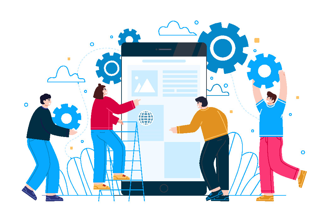
How should I build my landing page?
Headline and subheadline
The headline is the first thing the user will see when visiting your page. It is therefore important to create a link to the original ad at this point so that the person has the feeling that they are "in the right place". It is ideal if you put the keywords of your product at the beginning of the headline. From a purely psychological point of view, "More leads with the help of our product" has a different effect than "You can achieve more leads with our product". This way you ensure that the user learns the most important message of your entire landing page right from the start.
Heroshot
Similar to the headline, the central photo of your landing page is an element that is immediately visible. Therefore, it should match the headline and be as authentic as possible. If possible, try not to use stock photos in order to build up a certain trust with the user.
On the picture, you can either show the product itself or how a person uses or consumes it. If the person corresponds to your target group, the user, who most likely also belongs to the target group, will identify even more with your product. In this way, you create a positive experience in the user.
Logo
It is advisable to place a logo on the landing page. This creates trust with the user and if it is well placed, the user will remember it in the future. This way you stay in the mind of the potential customer, even if they have not yet generated a conversion during their first visit to your site.
Studies show that users expect to see the logo at the top left of the website.
Communication
In addition to the visual elements, there are also a few things to consider in terms of content. In general, we should keep in mind when designing the landing page that we have picked up the user while he is surfing the internet, i.e. he has not intentionally come across our product. Thus, his willingness to spend a lot of time on our site is limited. Therefore, it is important to clearly communicate what benefits he will gain from our product. So instead of talking about features, you should talk much more about the benefits of those features. Going back to our trainer example, it is more interesting for the user to know how comfortable and ergonomic the sole is and not what material and method it was made of.
Trust elements
To persuade users to make a purchase, you should build up as much trust as possible. This already began with logo integration and can be further expanded through other elements. For example, do you have a wider reach via social media? Likes or subscriber numbers suggest to visitors of your site that there are already many satisfied customers of your product.
It can also be helpful to show your company as personally as possible. For example, if you want to refer to a contact person from the sales department, a photo of this person creates trust, as the user has the feeling that they are actually communicating with a real person.
Another possibility are seals and certificates that the users of your site know. Trusted Shops and TÜV are well known. They provide security during the buying process. A prerequisite for this are reviews from past buyers.
Your landing page should be ready by this point - great! Now remember to make the conversion process as quick and easy as possible for the visitor on your page.